Paper pad design
A selection of paper pad designs I have created as part of a variety of papercraft collections. As part of each development, I reviewed the brief, created a colour palette and selected appropriate imagery to use in the designs. Some included a mix of detailed and plain designs, that could be used for mat and layering. It was important to ensure the designs complimented each other, and would co-ordinate well with other products in the range. Some paper pads included foil accents which added an element of luxury.
‘Tis the SEASON
A more recent paper pad I was designed, and really enjoyed creating. The theme was a warm, slightly vintage/rustic Christmas. I included lots of layered elements, including Christmas ephemera, gold foil effects, various textures, snow flecks and much more


sara signature caring thoughts collection
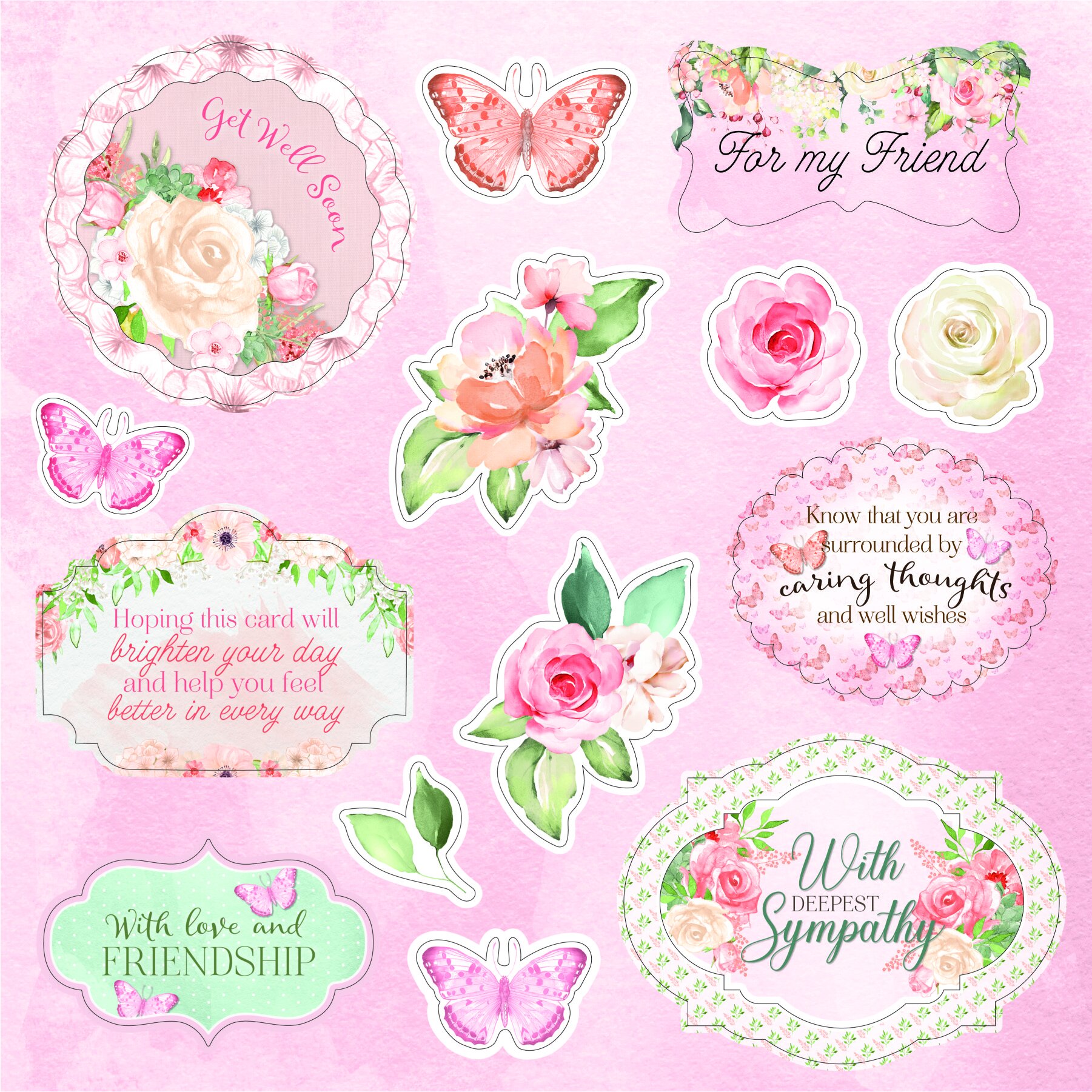
I designed 12, single-sided papers, plus 2 sheets of die-cut topper pages. The colour palette consisted of fresh, inviting tones of green, peach, pink and blue. Pretty florals, foliage and butterflies were used to create an assortment of patterns and layouts.


Chinoiserie collection
For this paper pad, I had to design 24 individual paper designs, to create 12 double-sided designs. The reverse of each design consisted of a simpler pattern, that complimented the more detailed, front designs. The brief asked to include some large, bold patterns, as well as more delicate patterns. The colour palette mainly consisted of rich, warm tones of red, yellow, dark blue and teal, as well as some softer pastel tones.


nature’s garden peacock collection
This paper pad consisted of 12 designs, some of which included foil accents in 3 co-ordinating colours, to add a luxurious feel. The colour palette consisted of rich, regal colours including purple, navy blue, teal and gold.


nature’s garden woodland friends collection
This paper pad included 12, single-sided designs, all in keeping with the woodland animal theme. The colour palette was very natural, mainly including browns and greens, with some warm tones of orange and cool tones of white.


sara signature garden of love collection
This paper pad consisted of 16, single-sided designs, all centred around pretty spring florals and foliage. I created a selection of detailed, layered designs, as well as simpler, more muted designs. I was also tasked with adding gold foil accents to 8 of the designs. The colour palette consisted of pinks, greens, cream and white.


sara signature nautical collection
This paper pad was the first that I got to design from start to finish. 16 designs were created in total. The colour palette consisted of mainly blues and browns, in keeping with the nautical, rustic theme of the collection. I enjoyed creating multi-layered designs, playing with patterns, adding texture and overlays to create different looks.


